Why Your Equipment's Look Impacts Retention
Walk into two studios with the exact same square footage, the exact same equipment brands, and the exact same class offerings. One feels premium. The other feels average. One has a waiting list. The other is running discounts to attract new members. What is the difference? It is not the equipment itself. It is how the equipment looks—together.
Most studio owners underestimate the power of visual cohesion. They buy equipment from different brands over several years, each piece chosen for its individual quality and price. The result is a collection of high-quality gear that looks like a collection of high-quality gear—mismatched colors, inconsistent finishes, clashing design languages. Members do not consciously register this as a problem. But their brains do. And their wallets do.
Further reading:
This article explains why equipment aesthetics directly affect member retention, how visual noise works against your studio, and why a unified visual identity is one of the highest-ROI investments you can make.
Visual Noise—The Silent Space Killer
Here is a psychological fact that every studio owner should know: the human brain has limited visual processing capacity. When a space contains mismatched colors, materials, and forms, the brain has to spend cognitive resources resolving these contradictions. Resources that should be used to perceive space and feel comfort are consumed by processing visual chaos. The final output? The brain concludes that the space is smaller, more cramped, and less relaxing than it actually is.
Experimental data backs this up. Two groups of participants entered rooms of identical actual size. One room had color-unified equipment with a consistent design language. The other had mixed colors, mixed materials, and mixed styles. The first group estimated the room size 18 percent larger than actual. The second group estimated it 12 percent smaller. The "perceptual gain" from visual unity: 30 percent.
For a 60-square-meter studio, that 30 percent perceptual gain means members feel like they are training in a 78-square-meter space. They are more relaxed, more willing to stay longer, and more likely to bring friends. The space feels intentional. It feels professional. And professional is exactly what members are paying for.
Further reading:
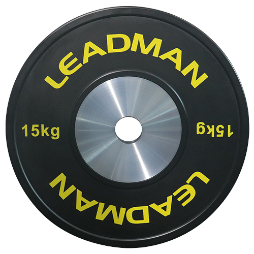
Most studios are not suffering from a lack of quality equipment. They are suffering from visual noise that makes quality equipment look cheap. The same squat rack that looks premium in a black-on-black studio looks average when placed next to a red cable machine and a blue dumbbell rack. The equipment did not change. The context did.
What Mismatched Equipment Signals to Members
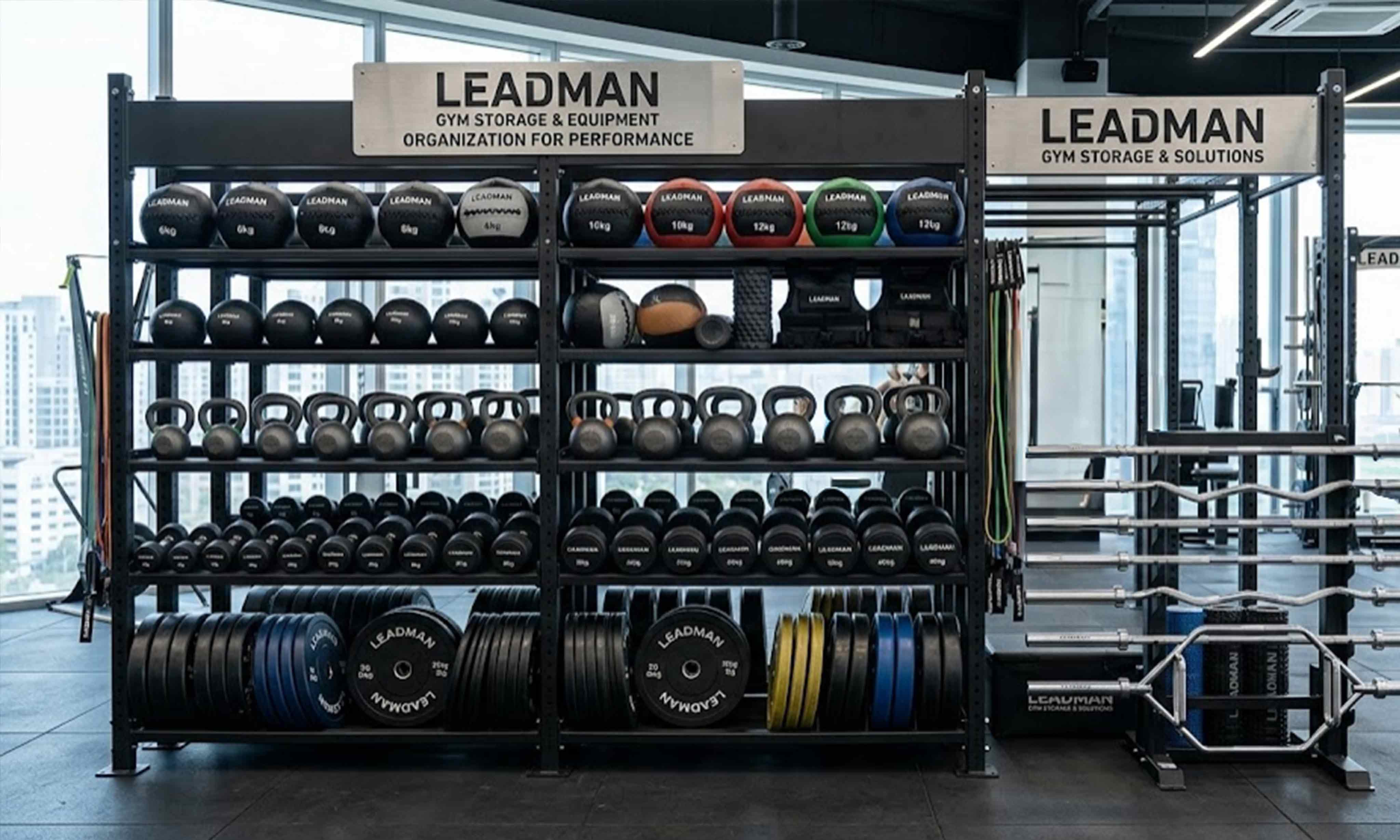
Every piece of equipment in your studio sends a signal. A unified color palette signals intentionality. Consistent finishes signal professionalism. Matching design language signals that the studio is organized, has standards, and pays attention to detail. Mismatched equipment sends the opposite signal: the studio is a collection of random purchases, the owner does not have a clear vision, and attention to detail is not a priority.
Members translate these signals into trust. A studio that looks organized is assumed to be organized in its programming, its coaching, its operations. A studio that looks chaotic is assumed to be chaotic in all these areas. This is not a conscious calculation. It is a subconscious shortcut that every human brain makes. And it happens within the first three seconds of walking in.
The cost of this mismatch is not just aesthetic. It is financial. Research in consumer psychology shows that visual coherence is one of the strongest predictors of willingness to pay a premium. When a brand looks unified, consumers assign higher value to the entire offering. The same service in a visually unified space commands 10 to 15 percent higher prices than in a visually disjointed space. The same membership. The same coaching. The same equipment. Just better visual cohesion.
Think about what that 15 percent means for your studio. If your membership is 800 yuan per month, that is an extra 120 yuan per member per month. For a studio with 50 members, that is 6,000 yuan per month, or 72,000 yuan per year. Visual cohesion is not just about "looking nice." It is about earning what your services are actually worth.
Why Customization Is Not Just for Big Budgets
Many studio owners hear "customization" and immediately think "expensive." They assume that custom colors, custom logos, and consistent finishes are only for large commercial chains with unlimited budgets. This is a mistake. Customization is not an all-or-nothing proposition. There are low-cost, high-impact ways to unify your visual identity without replacing all your equipment.
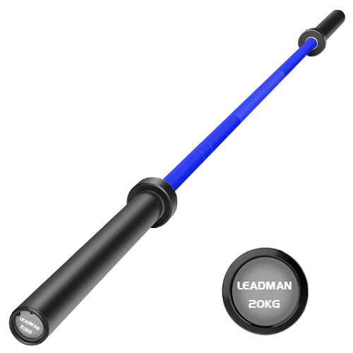
First, color coordination at the point of purchase. When buying new equipment, choose a consistent color palette from the start. The marginal cost of choosing black or a brand color over standard red or blue is minimal. Over a few purchase cycles, you will gradually replace mismatched pieces with unified ones. This is a slow but cost-effective approach.
Second, surface-level updates. Spray painting older equipment to match a unified color scheme is a viable option for some pieces. Powder coating is more durable but more expensive. A middle ground is using vinyl wraps or decals to cover outdated logos and add brand colors. These are low-cost updates that significantly improve visual cohesion.
Third, strategic replacement. Instead of buying new equipment all at once, prioritize replacement of the most visually prominent pieces first. The equipment that is visible from the entrance has outsized impact on first impressions. Replace those pieces with color-matched versions before tackling storage racks or less visible equipment.
Further reading:
Customization is not about spending money. It is about making intentional choices. The studio that chooses black equipment across three purchase cycles ends up with a unified look in three years, spending no more than the studio that chose random colors in each cycle. The difference is not budget. It is planning.
The Retention Chain—How Looks Lead to Renewals
Understanding why visual cohesion drives retention requires following the complete psychological chain. It does not start with "looks nice." It starts with the brain's automatic assessment of safety and competence. And it ends with a membership renewal decision. Let us map the chain step by step.
Step one: First impression. A member walks in and sees a visually unified studio within three seconds. The brain registers intentionality, organization, and professionalism. This creates a baseline of trust. The member relaxes into the space.
Step two: Cognitive ease. Visual cohesion reduces the brain's cognitive load. There are no contradictions to resolve. The brain processes the space effortlessly. This effortless processing is interpreted as comfort. The member feels "at ease." They stay longer, train harder, and leave feeling more satisfied.
Step three: Perceived value. The member compares the studio experience to other options in the market. The visually unified studio looks more polished, more organized, more professional. The brain assigns higher value to the membership. The member feels like they are getting a premium experience.
Step four: Renewal decision. When the renewal date approaches, the member weighs the options. The premium feeling from step three translates into a willingness to continue paying. The member does not say "I am renewing because the equipment colors are consistent." They say "I just like training here." But the visual consistency is a large part of why "here" feels different from "everywhere else."
Each step is psychological. Each step is automatic. And each step depends on the visual foundation that your equipment establishes from the moment members walk in. You cannot build trust, comfort, perceived value, or renewal loyalty on a foundation of visual chaos. The chain breaks before it even starts.
The Case for Branded Environment
A branded environment is not a luxury. It is a communication tool. Every piece of equipment in your studio is a touchpoint that communicates your brand's values. A black rack with a small logo communicates precision and professionalism. A red rack with a generic brand communicates that equipment is just equipment. The difference is subtle, but the cumulative effect is enormous.
When members see the same color palette, the same logo treatment, and the same material quality across all equipment, they understand that your brand has standards. Standards that do not compromise. Standards that apply to everything. That understanding builds trust. And trust is the currency of retention.
Consider the hospitality industry. Luxury hotels understand that branded environments are not about decoration. They are about communication. The consistent color palette, the signature scent, the uniform staff, the coordinated furniture—all of it communicates a standard. The same logic applies to fitness studios. Your equipment is your furniture. Your color palette is your signature. Your visual consistency is your standard. And your standard is what members are buying.
Studios that invest in branded environments consistently outperform studios that treat equipment as purely functional. The same equipment in a branded environment commands higher prices, attracts more members, and retains them longer. The equipment does the work. The brand environment sells the work.
Start Small, Think Long-Term
Unifying your studio's visual identity does not require a complete equipment overhaul. It requires a plan. A three-year plan to gradually replace or update equipment with a consistent color palette and design language. A plan that starts with the most visible pieces and works inward. A plan that coordinates every new purchase with the existing visual identity.
The cost of this approach is no higher than the cost of random purchasing. The difference is intentionality. Instead of buying equipment based on price and availability alone, you buy equipment based on price, availability, and visual fit. You pass on a great deal on a red rack because your studio is black. You wait for the black version, or you order it customized. The immediate gratification is lower. The long-term brand value is infinitely higher.
If you are planning to open a new studio or renovate an existing one, start with the visual identity first. Choose your color palette before you choose your first piece of equipment. Define your design language before you start placing orders. Every subsequent purchase follows the same standard. Three years later, your studio will have a cohesive identity that no competitor can easily replicate.
Further reading:
What Your Equipment Says About You
Every piece of equipment in your studio speaks. It speaks to your members, your prospects, and your competitors. It speaks about your standards, your attention to detail, and your commitment to quality. Mismatched equipment speaks chaos. Unified equipment speaks control. And control is exactly what members are paying for when they choose a premium boutique studio.
You have already invested in quality equipment. You have already invested in a great space. Do not let visual inconsistency undermine all of it. The difference between a studio that retains 70 percent of its members and one that retains 85 percent is not just better coaching or better equipment. It is the cumulative impression of a space that looks intentional, professional, and trustworthy.
Your equipment is your most visible asset. Make sure it is saying the right thing.